

PROJECT OVERVIEW
Client: City of Boston
Roles: User Researcher, Interaction Designer, User Experience Designer
Tools: Sketch (Wireframe), InVision (High-Fidelity Prototype),
Government institutions are falling more and more behind when it comes to the digitization of their services and Boston wants to keep themselves ahead of the curve. They already have some very basic ones, but they want to provide citizens with their own logged-in environment where they can see everything related to their governmental interactions.
The Challenge
Along with the website, Boston want to bring all services available online to citizens. They wants to expand their services to certificates and a logged-in area that include all services related the citizens. Eventually, every citizen will be able to log-in and view or request any services that they need. Fully online. Fully self-service.
The Solution
To provide an easy and simple way for users to request a birth, death, or marriage certificate fully online.

KEY INSIGHTS
86% of their population uses internet with 77% of the population owns a smartphone. There are many online services that already exists that make our lives easier and save us time, such as getting to our destination, or ordering delivery take out right from our phone. So being able to request vital records online should be a no brainer!
USERS & AUDIENCE
The target users of this feature includes citizens who are newly weds, citizens who wishes to legally change their names, join health benefits, or filing joint taxes amongst others. These users typically have full time jobs and cannot afford to take time off work to obtain a marriage certificate in person.
METHODOLOGIES
Secondary Research to learn more about Boston's population and demographics
Site Audit with current website
SWOT Competitive Analysis with other cities' government websites
Customer interviews to learn more about their goals, pains, and needs.
Customer Goals:
1) To complete and confirm their marriage
2) Hassle free and quick process to submit request
3) To be prepared prior to going in person with clear instructions and correct forms
Customer Frustrations:
1) Having to take time out of work day to go in person with spouse
2) To wait in long lines for hours as appointment times are often not as accurate.
3) By Mail: Anxiety of having it mailed, fearing it might get lost in the mail.
4) Anxiety of having to type personal information on an outdated server and making sure everything inputted is correct without errors
PROTOTYPE
Using style guide that Boston.gov was able to provide, I was able to create high-fidelity responsive UI wireframes to use to Prototype using Invision.
DESIGN PROCESS
With my customer interviews, I was able to combine my findings to create the persona, Nora and Nick, whose goals is to have an easy, quick, hassle free process of obtaining their marriage certificate without having to take time off of their daily routine to stand in line for hours.
PERSONAs

To map out the screens and pages that I will need to design, I created a site map that prioritize the screens that I will be modifying and creating.
INFORMATION ARCHITECTURE

With my persona in mind, I mapped out a flow of how she will reach her destination and complete her task successfully step by step. This will help me determine some of the pages and screens that is needed to design in order to complete this flow.
TASK FLOW

USER FLOW
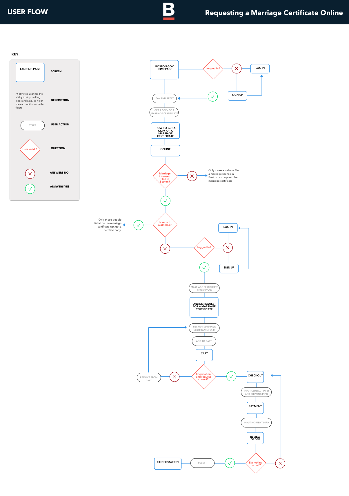
Using the existing pages and services already available on the website, I was able to quickly produce some wireframes that aligns with their other existing pages. With these wireframes, I mocked up how the sign up and log in screen will look as well as the application form flow.
WIREFRAMES


UI kit
oUTCOME
With my prototype, I conducted some user testing with 3 participants to test the new feature. Through the usability test findings, I was able to learn of the successes and frustrations users had when navigating through my prototype.
Key Performance Indicators (KPI)
3/3 users were able to complete end-to-end tasks within the first attempt
3/3 users were able to described the process and requirements in order to obtain a marriage certificate in Boston as they all agreed that “How to get a marriage certificate” page consisted all the information they are seeking upon visiting the site
3/3 users agreed that the flow was straightforward, quick, and easy.
NEXT iterations
In order to grow user account experiences, I will reiterate to:
Make the application flow from form completion to purchasing mobile friendly
Add more identity verification questions to the sign up page.
Create wireframe and mock-up pages of user accounts and what they can see or access once they are signed up and logged in.
Add more online features to other services that can be completed online
FINAL THOUGHTS
I’ve learned that designing for a government is quite different from designing for a business as it is a public service and the product will be accessible to everyone. Because of this, I’ve spend more time on research to learn more about the universal demographic facts about the city. But in the end, following an existing brand and fitting everything together with the current website was a new experience that I enjoyed a lot. I definitely felt accomplished being able to design pages that fits with their current brand and keeping everything consistent and cohesive. I’ve also learned quite a lot about the process of obtaining a marriage certificate along the way!